InTDS ArchivebyMy Data TalkFolium Map: How to Create a Table-Style Pop-up with HTML CodeA Step-by-Step Guide to Level-up Your Folium Skills for Geospatial Data VisualizationDec 16, 2021Dec 16, 2021
InTDS ArchivebyRobin ChanCreating a dual-axis Combo Chart in PythonA hands-on tutorial to create a dual-axis combo chart with Matplotlib, Seaborn, and Pandas plot()Jan 31, 2022Jan 31, 2022
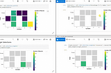
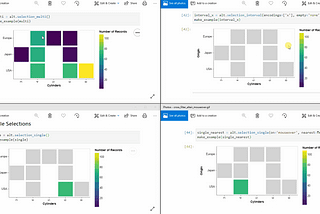
InTDS ArchivebyNok ChanJupyter Superpower — Interactive Visualization Combo with PythonIntroductionMar 10, 20194Mar 10, 20194
InTDS ArchivebyNicholas LeongPython For Data Science — A Guide to Data Visualization with PlotlyIts 2020, time to stop using Matplotlib and SeabornDec 9, 20196Dec 9, 20196
InTDS ArchivebyJP HwangCreate effective data visualizations of proportionsBest ways to see individual contributions to a whole and changes over time, at various dataset sizes — (incl. demonstrations, code & data)Feb 17, 20203Feb 17, 20203
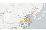
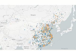
InTDS ArchivebyKefei MoMeet Plotly Mapbox. Best Choice for Geographic Data VisualizationWhat Plotly is and how to use it. A step by step guide on exploratory data analysis and interactive dashboard presentationJun 19, 20201Jun 19, 20201
InTDS ArchivebyAlan JonesHow Not to Lie with ChartsYou can use data visualization to inform, or misinform. We look at the things to avoid if you want to do the former and not the latter.Jan 28, 20221Jan 28, 20221